April 26, 2002
Okay, more graphs. You've
Okay, more graphs. You've all been asking about them (albeit in snide sniggering tones).Here's the first one, although keep in mind that the last week, week 16, is a partial week.
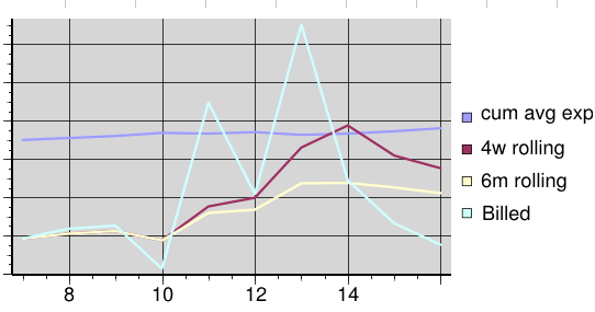
Explanation:
Billed (cyan): - This is how much I billed each week.
6m rolling (yellow): - This is my average weekly income, calculated each week from the previous six months (starting 2/17).
4w rolling (red): - This is my average weekly income, calculated each week from the previous four weeks.
cum avg exp (blue): - Some people like Beth didn't understand my explanation of this last time. What's more probable is that she was the only one paying enough attention to even ask. See, she's a Virgo. Anyway. I know how much I need to make this year to meet the year's expenses. I also know how much I've made so far. So every week, I subtract to find out how much I still need to make, and then divided it by how many weeks are left in the year. That's why, if each week I don't meet the new target, the blue line goes UP. You'll notice that the blue line actually went down each time the cyan line went above it.
Anyway, that graph is way too complicated. It gives me a few different ways to feel good about myself (yay! the red line is above the yellow line!) and bad about myself (oh no! the yellow line is going down!), and many many ways to feel confused about myself. So, you ask, did Curt come to his senses and stop making silly graphs?
NO, Of Course Not! Curt came to his senses and made a NEW graph! Here it is:
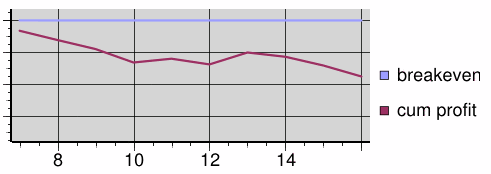
So what's the story behind this graph? Okay, complicated explanation first. I figured out how much I would need to make for the year. Then I divided it into equal weekly amounts starting from when I began freelancing. (Same amount every week.) Then I took that negative amount and counterbalanced it with how much I made that week. I do that for each week. That's the line that shows that.
Medium explanation: When the red line is flat, it means I have met my expenses for the week. When the red line meets the blue line, it means I have met my expenses for the year up through that week. If I'm at the blue line when the year ends, I've made exactly what I need for the year. If it's above the blue line, I'm ahead of the curve and on track to make a profit for the year. If it meets the other line that you can't see right now because it is so far above the blue line, it means I have met all my expenses for the year in total and am making play money.
Easy Explanation:
- Red line go down = losing ground.
- Red line flat = on target for week.
- Red line go up = making up ground.
- Red line on blue line = on target for year.
- Red line go way above blue line = I buy a piano.
What does it all mean? I don't know, it's just what I do late at night when I don't feel like looking for work or sleeping or programming or writing in my journal. What do YOU do at those times? At least I'm learning how to make pretty graphs. So nyeah.
I will write a song honoring the last person to insult me (no deadline, by the way). (Get it?)